# Button Block
> Learn about the Button Block for adding call-to-action links in VIDEOJOBS.
Source: https://docs.videojobs.io/button-block
> For the complete documentation index, see [llms.txt](https://docs.videojobs.io/llms.txt).
# Button Block
The Button Block is a visually distinct element, similar to the Video Block, designed to capture attention. This block allows you to add a button that links to a specified destination, typically a form for candidates to fill out.

## Edit Mode
In edit mode, you will see some additional options available to you.
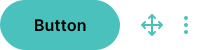
All blocks, including Button Blocks, can be visually rearranged using a simple drag-and-drop interface via the icon. This allows for easy organization and customization of your content layout.
## Analytics Tracking
Each click on the button is tracked, providing you with insights into how many people have applied or interacted with the button.
## Block Options
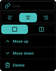
Each block comes with a set of features accessible through the three-dot icon located in the top right corner. This icon is visible when the block is in Edit mode, among other scenarios.
### Available Options
Within the block's options menu, you can:
- Link to a form or an external website.
- Toggle between left, center, and right alignment.
- Toggle between half-width or full-width block.
- Move the block up.
- Move the block down.
- Delete the block if it's no longer needed.
Learn more about Benefits Block, with all its features.
Learn more about Team Block, with all its features.